Learn how custom fields work, how each field type behaves, and what to keep in mind when choosing or creating them.
Custom fields help you collect and store information about your contacts in Kartra that is not collected by Kartra’s built-in (system) fields. Once a field exists, you can use it in:
- Forms
- Automations
- Filters
- Emails
- Surveys
- Checkout forms
- Registration forms
Where to create custom fields
Recommended method:
- Go to Contacts > All contacts > Custom fields
- Click + Field
Learn how to create custom fields.
This method is ideal when you want the field ready for use across multiple forms or funnels.
You can also create custom fields from within other forms’ configuration wizards if you need a field you haven't already created while you're building a calendar, opt-in form, survey, or checkout.
Standard vs. custom fields
Kartra includes standard fields such as:
- Name (first, middle, last)
- Company
- Phone (with or without country code)
- Address (+ city, state, country)
- Timezone
- Media links (website, Facebook, X, LinkedIn, Instagram)
These are system fields and cannot be edited or deleted. The Email field is mandatory in all forms, since an email address is required to create and identify a contact's profile. The rest can be added or removed from various forms as needed.
Custom fields:
- Can be edited, renamed, reused, and deleted if no longer required
- Are available for all forms within the account.
- Store data per contact
How custom fields store information
Regardless of where the data is collected (forms, surveys, manual edits, imports), custom fields store the following types of values:
- Single-value fields: dropdown, radio button
- Multi-value fields: checkboxes
- Free text: text input and text area
Every resubmission of a form replaces the previous values. This ensures the contact profile always shows the most recent information.
Types of custom fields
Kartra supports five custom field types. Each type offers a different experience and serves different purposes.
Dropdown menu
A dropdown allows a visitor to select one option from a predefined list.
- Options can contain up to 255 characters each.
- The field label appears inside the dropdown by default and is greyed out when the dropdown is expanded.
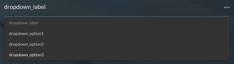
Use dropdowns when you want clean, consistent data for segmentation (e.g., Industry, Budget Range, Interests).
Radio button
Radio buttons also allow one selection, but all choices are displayed visibly on the page.
- Options may each contain up to 255 characters.
- The field label appears above the list of radio buttons.
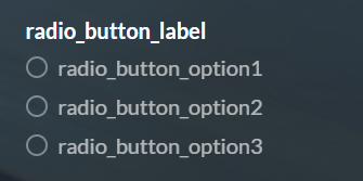
Radio buttons are best when you want the visitor to see all options without opening a menu.
Checkbox (multi-select)
Checkboxes allow the visitor to select multiple options.
- Each option supports up to 255 characters.
- The label appears above the list of checkboxes.
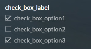
In contact profiles, all selected options appear separated by commas.

Text input & text area
Both field types:
- Require a label to be created, but the label does not display on the form.
- Only the placeholder text (up to 250 characters) is visible to the visitor.
- Can store up to 365 characters.
Differences:
| Text input | Text area |
| One-line text box | Larger, multi-line text box |
| Intended for short responses | Good for short to moderate open responses |
Do not use these fields for long-form content.
Custom fields elements
Each custom field in Kartra is built from a set of elements. Some of them apply to all fields, while others depend on the field type you select.
Required for all custom fields
Field identifier (internal name)
- A unique codename for the field (up to 40 characters)
- Appears as the field name inside contact profiles
- Used for email variables and automation rules
- Never shown to visitors
- Cannot be changed once created
Choose identifiers that are short, descriptive, and permanent.
Field label (public-facing name)
- Up to 250 characters
- Describes the purpose of the field
- May or may not appear to visitors depending on the field type
Label behavior by field type
- Dropdown: appears inside the field as default text
- Radio buttons: appears above the option list
- Checkboxes: appears above the option list
- Text input: does not appear; only placeholder displays
- Text area: does not appear; only placeholder displays
- Surveys: visitors see the survey question, not the label or identifier
Required only by specific field types
Options (dropdown, radio, checkbox fields)
- The predefined choices visitors can select from
- Each option supports up to 255 characters
- Dropdown and radio fields allow one selection
- Checkbox fields allow multiple selections, and are stored as a comma-separated list in the contact profile
Placeholder text (text input and text area fields)
- Up to 250 characters
- Appears inside the field when empty
- Serves as the visitor-facing prompt, since labels do not display for these field types
- Used only for text-based fields (text input and text area)
Optional
'Mandatory' toggle: When enabled, the visitor must complete the field before submitting the form.
Best practices
- Choose dropdown or radio fields when you expect to segment or filter contacts later.
- Use checkboxes when multiple selections are expected.
- Use text-based fields for open responses, but avoid them for data that needs to match or stay consistent.
- Use text area fields only for short notes or comments, not long-form content.
- Create a new field when the meaning of a response changes, don’t repurpose existing fields.
- Give identifiers clear and stable names, since they cannot be changed later.
Limitations
- Text input and text area fields do not display their labels to visitors; only the placeholder is shown.
- When a form is resubmitted, checkbox fields overwrite the entire list of selections.
- Custom fields cannot store data from anonymous survey responses.